
Global Header Redesign


Project Overview
Company: Thermo Fisher Scientific
Product: B2C Ecommerce Platform
Role: Lead UX Designer
Team: 1 UX researcher, 1 A11y partner, 1 engineering lead, 1 marketing writer, product owner, stakeholders
Tools: Figma, Miro, Powerpoint
Timeline: Multi-phase initiative
Key Focus Areas
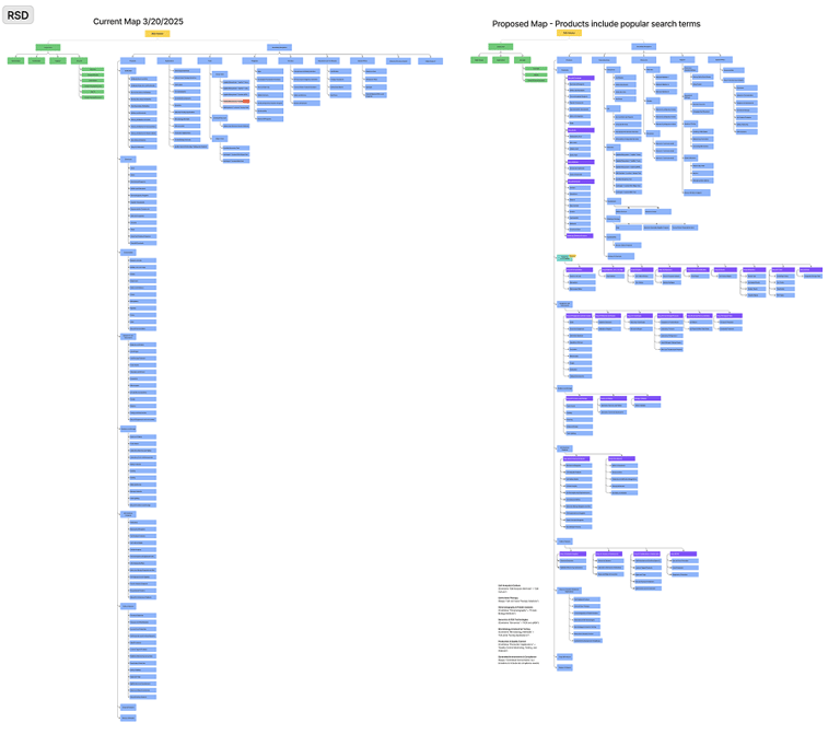
Navigation architecture
Product discoverability
Stakeholder alignment
Scalable navigation design
Experimentation and validation
Fisher Scientific’s ecommerce platform supports a vast catalog of scientific products used by researchers, laboratories, and institutions worldwide.
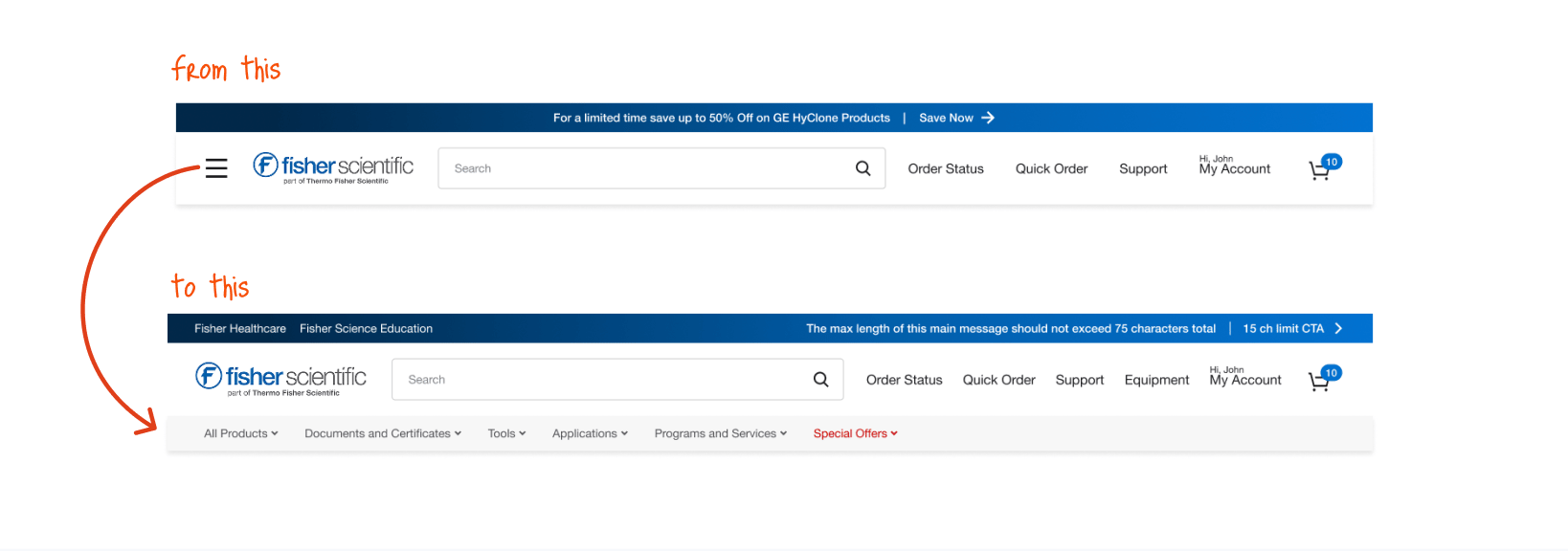
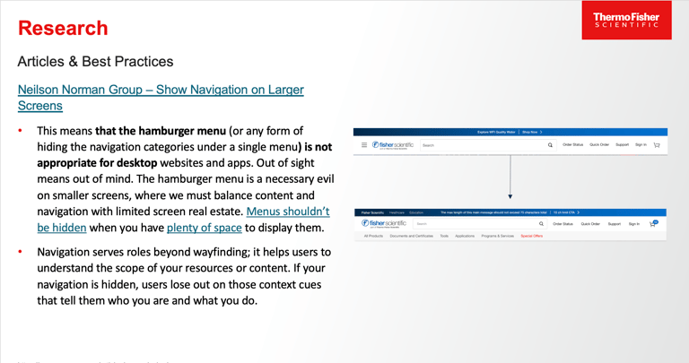
During a previous site update, the global navigation was simplified into a hamburger menu on desktop. While this approach is common on mobile, research has consistently shown that hiding navigation on desktop can significantly reduce discoverability.
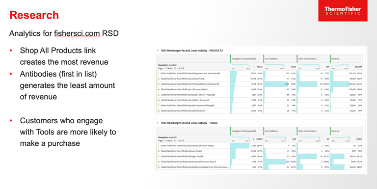
Soon after the change was released, analytics began revealing unintended consequences.
The Problem
Key Issues
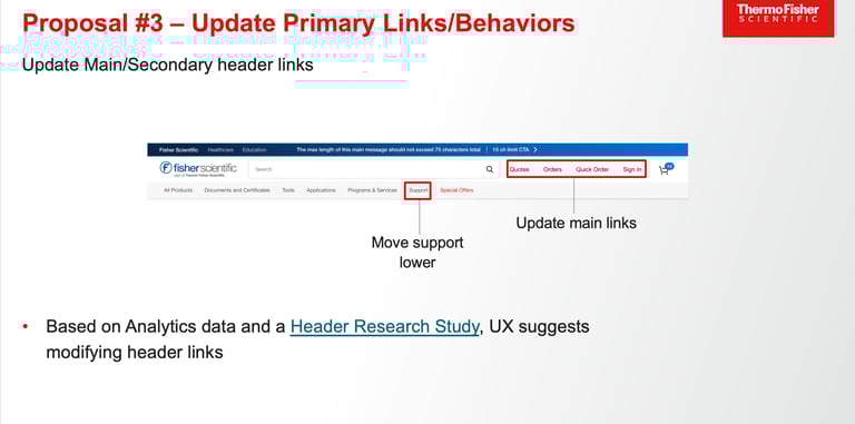
Critical product categories were hidden behind a hamburger menu
Engagement with category navigation declined
Users increasingly relied on search to find products
Business teams struggled to add new navigation links within the limited design structure

My Role
My responsibilities included:
Analyzing analytics data to identify engagement drop-offs
Conducting a heuristic evaluation using Nielsen Norman usability principles
Leading navigation discovery and prioritization sessions with stakeholders
Designing and iterating new navigation concepts
Partnering with engineering to ensure scalable implementation
Defining testing hypotheses and success metrics
I led the UX strategy and design for the global header redesign.
Research & Discovery
Heuristic evaluation of the current navigation
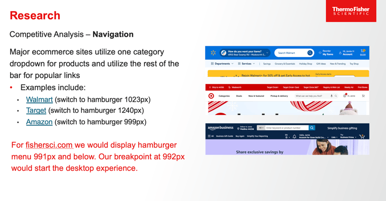
Competitive analysis of enterprise ecommerce navigation patterns
Analytics review to identify engagement drop-offs
Review of research on hamburger menu usage on desktop
Methods
To better understand the root cause of the engagement decline, I conducted a discovery phase combining analytics, usability principles, and industry research.

Key Insights
Hidden navigation hurts
Research and usability studies consistently show that hamburger menus decrease interaction on desktop because they hide primary navigation options.
Users rely on scanning
Users browsing scientific product catalogs tend to scan visible categories before resorting to search.
The existing design structure created friction whenever teams needed to introduce new categories.
Navigation must scale
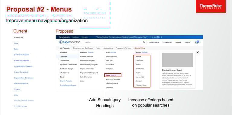
Design Exploration
I explored several navigation approaches to determine the right balance between visibility and simplicity.
Key considerations included:
how many categories should be exposed
how to prevent visual overload
how to maintain scalability as new categories were added
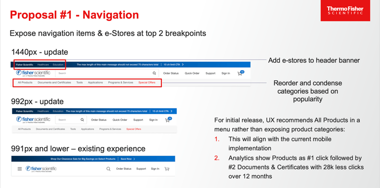
Through collaboration with product and engineering, we developed a two-tier navigation model.
Primary Navigation
High-priority product categories were exposed directly in the global header to support quick scanning and discovery.
Secondary Navigation
A secondary menu structure provided access to deeper category levels without overwhelming the header.
This approach allowed the design to remain visually clean while making key navigation paths immediately visible.
Collaboration & Alignment
Because the global navigation impacted multiple teams, cross-functional alignment was critical.
I facilitated working sessions with:
product managers
marketing stakeholders
engineering teams
These sessions helped prioritize category placement and ensure the final structure supported both user needs and business goals.
Engineering collaboration was particularly important in defining a navigation architecture that could be reused across multiple global sites.
Testing & Validation
Before implementation, we validated the new navigation approach through usability testing and experimentation.
A/B Testing
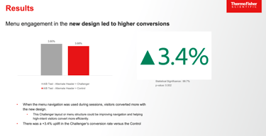
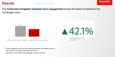
We then conducted an A/B test comparing the existing hamburger navigation with the redesigned exposed navigation.
42% of users engaged with the newly exposed navigation
Users interacting with the new design showed a 3.4% lift in conversion
The results demonstrated that small changes in navigation visibility can have measurable impact on user engagement and business outcomes.
Usability Testing
Several usability sessions were conducted to evaluate:
navigation clarity
dropdown menu interaction
ability to locate product categories
Participants were able to locate categories more quickly with the exposed navigation structure.


Accessibility Considerations
The redesigned navigation also incorporated accessibility improvements.
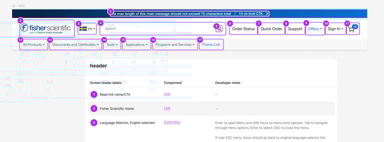
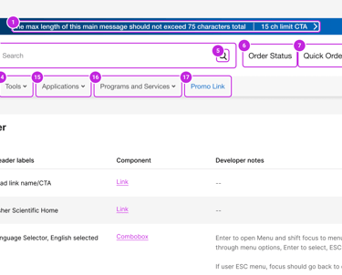
These included:
improved label clarity for screen readers
keyboard navigation support for dropdown menus
improved color contrast for better readability
Ensuring the navigation remained accessible was essential given the wide range of users interacting with the platform.
Final Design
The final solution introduced a scalable global header that:
exposes primary product categories
supports deeper category exploration
balances visibility with visual simplicity
supports future navigation expansion
Design specifications were documented in Figma and included:
US header and navigation structures
localized versions for international markets
accessibility annotations
interaction behaviors and states


Reflection
This project reinforced how significantly navigation design influences product discovery.
By combining analytics, usability principles, and cross-team collaboration, we were able to transform a declining engagement metric into a measurable improvement in conversion.
It also highlighted the importance of validating design decisions through experimentation, particularly when working on large-scale ecommerce platforms.
More
Projects I’ve led or contributed to, each focused on solving real product challenges through research, collaboration, and thoughtful design.

Internal Dashboard Redesign
Redesigned an internal CSR request management tool to improve team visibility, request ownership, and workflow coordination.

Optimizing Account Registration
Improving onboarding workflows and increasing business registration conversion through research, design thinking workshops, and iterative UX improvements.